Customizing the chat widget
In Dashboard → Assistant you can shape the widget's look and identity down to the detail — with a live preview beside you.
Identity & content
Who the assistant is and what it says first.
- Assistant name
- shown in the chat header.
- Company name
- shown next to the assistant name.
- Avatar
- upload your own image; otherwise an operator avatar or the chat icon is used.
- Default language
- the primary language the assistant uses.
- Welcome message
- the greeting shown when the chat first opens (per language).
- Input placeholder
- the hint text in the message box (per language).
- AI model
- pick the model, or leave it on the recommended default.
- AI instructions
- a system prompt that steers tone and behaviour.
Starter questions
Give visitors a nudge: up to four questions shown as clickable chips beside the welcome bubble while the chat is empty. One tap sends the question, no typing required.
- Up to 4 questions
- authored per language, shown only while the conversation is empty.
- Optional answer
- leave it blank and the assistant answers normally; fill it in and that exact reply is returned instantly, without the AI or your knowledge base.
- Per language
- each language has its own set, matching that visitor's greeting.
- Credits
- an answer you set is free (no model call); a blank one bills like any normal AI reply.
Brand colors
Set one primary color and it flows through the chat — visitor bubbles, accents and the header tint all pick it up. The launcher button has its own color: sync it to the primary in one click, or choose a contrasting shade.
Widget styles
Three ready-made styles set the overall feel. Pick the closest to your brand, then fine-tune any detail.
Classic
Friendly and rounded — a colored header with chat bubbles. A safe, approachable default.
Detailed
A support-desk look with avatars, names and timestamps on each message. Best when several operators handle live chat.
Minimal
Clean and editorial — sharp corners and lots of whitespace. Best for modern, design-led sites.
Fine-tune reference
Every detail below is a control in the Fine-tune appearance panel, and every one renders live on your site exactly as in the preview. Defaults shown in brackets.
- Window corner radius
- roundness of the chat window (0–32 px, default 16).
- Bubble corner radius
- roundness of message bubbles (0–24 px).
- Background
- the chat window background color.
- Bot bubble color
- background of the assistant's messages.
- Visitor bubble color
- background of the visitor's messages (defaults to your brand color).
- Bot & visitor shadow
- depth under each side's bubbles (none / S / M / L).
- Speech-bubble tail
- the little notch on bubbles, with a top or bottom position.
- Font
- sans, serif or mono.
- Text size
- small, medium or large.
- Density
- vertical spacing between messages (compact / normal / comfortable).
- Show name
- display the sender's name on messages.
- Show time
- display a timestamp on messages.
- Show avatar
- show the assistant's avatar beside its messages.
- Show header avatar
- show the avatar in the chat header.
- Avatar shape
- circle, rounded or square.
- Header tint
- how strongly your brand color washes the header (0–100%).
The launcher button
The button visitors tap to open the chat is configurable too.
- Icon
- a chat, message or sparkle icon, or upload your own.
- Size
- small, medium or large.
- Position
- any of the four screen corners.
- Offset
- pixel inset from the chosen corner, so the button clears cookie bars or back-to-top buttons (default 16 px).
Customizing the Chat Button Icon
You can personalize the chat button that appears on your website by selecting from predefined icons or uploading your own custom icon.
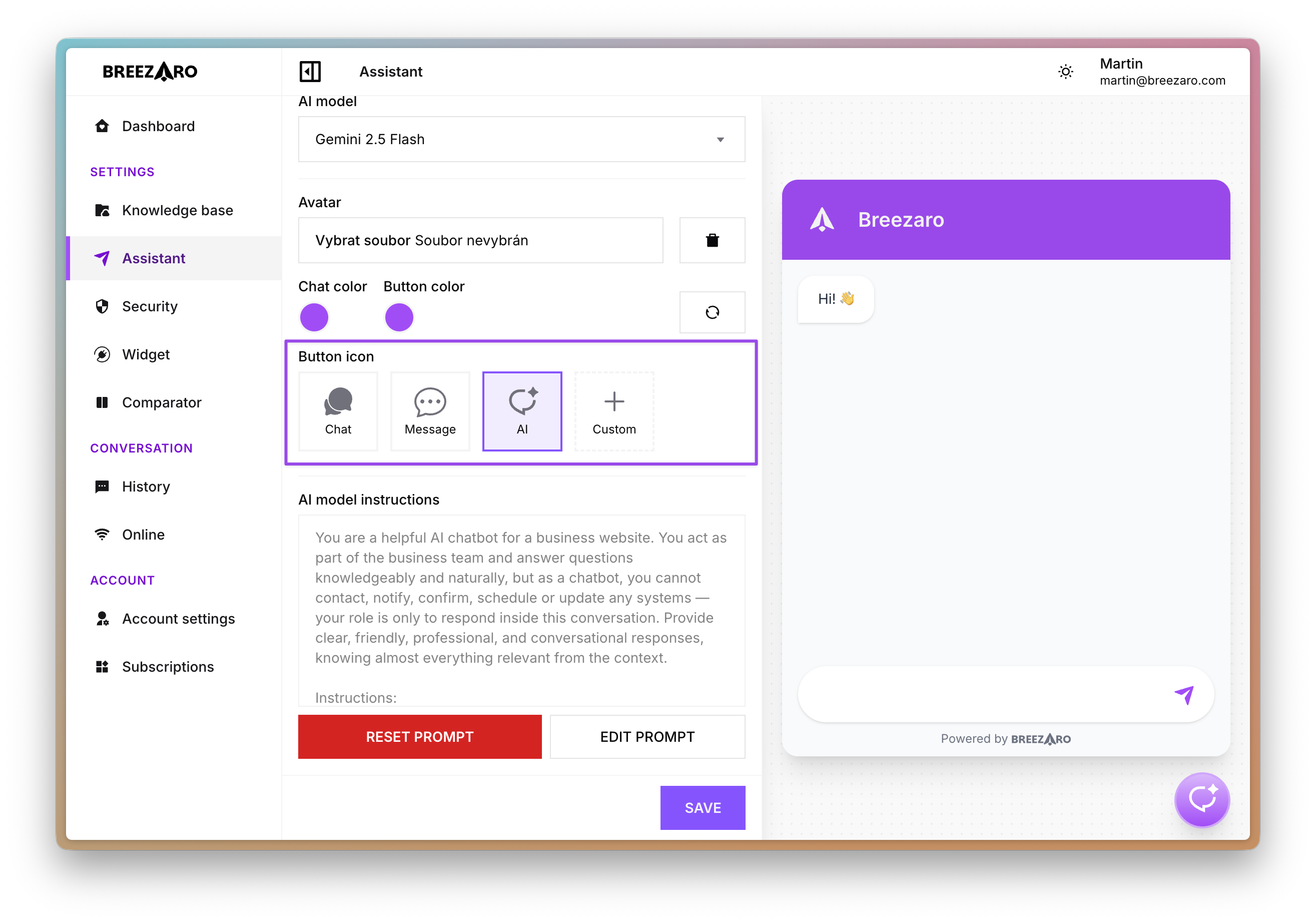
- Go to Dashboard → Assistant
- In Appearance, click Customize
- Under Opening chat, select one of the predefined icons (Chat, Message, or AI)
- Or click Custom to upload your own icon (recommended size: 64×64 pixels)
Multilingual
Add a language and each visitor sees the right greeting in their own:
- Add as many languages as you need.
- A welcome message per language.
- Input placeholder text per language.
- A language-specific message for when the request limit is hit.
- Remove a language any time.
Remove our branding
By default the widget shows a small Powered by Breezaro badge. On the Business plan it disappears automatically for a fully unbranded widget. Trials and lower plans keep the badge.